Chapter 4 Graphical User Interface (GUI)
This chapter provides an overview of Vibe’s Graphical User Interface (GUI).
The following is covered in this chapter:
- 4.1. Introduction
- 4.2. {VIBE} Menu
- 4.3. Pages
- 4.4 WorkSpaces
- 4.5. Layouts
- 4.6. Smart Screen
- 4.7. Toolbars
- 4.8. Live Display
- 4.9. Live Parameter Display
4.1 Introduction
Vibe uses a Multi-touch based interface with simple familiar gestures for navigation.
Supported gestures:
◾ Two fingers for swipe and scrolling.
◾ One finger select.
◾ Multi-selection via ️️⤴ ⤵ shaped gestures.
◾ Multi-selection via window.
Vibe directly supports up to 4 monitors, two embedded and two external. (Additional monitors may be added using DisplayPort 1.2 or higher MST splitter for a total of 4 external monitors at 1920 x 1080 resolution). The large 21” embedded screen is general-purpose like the external monitors.
The smaller 11.6” Smart Screen is dedicated to displaying context sensitive interactive parameter information such as color pickers and gobo pickers.
Each monitor, (excluding the Smart Screen) can contain one Window Frame.
Window frames can contain one of three Workspace Templates.
Each Template has a dedicated display in the lower area. This area will have different fixed options and information depending on the selected Workspace Template.
The remainder of the template may be freely customized by the user.
Each Template can contain up to 4 Pages that can be toggling using the WorkSpace Template Keys or by tapping the yellow {VIBE} Menu key at the bottom left of each Workspace Template and tapping the {PAGES} key to the right of the {VIBE} key to open the page’s display.
Each Monitor (excluding the Smart Screen) can contain its own independent set of WorkSpace Templates.
Workspace Templates are organized into three familiar categories, each with a dedicated display key. These keys are found above the top left corner of the Smart Screen:
[PROG] - (Program)
[PLAY-B] - (Playback Controllers)
The Workspace Template Keys are specific to the monitor that has focus (last touched or selected via a mouse).
4.2 VIBE Menu
The {VIBE} Menu is a hierarchical menu containing logically grouped sub-menus. It is used to access common system functions such as Save and System Settings as well as configure Workspace Template displays.
Vibe Menu can be opened at any time by tapping on the Vibe key in the low left corner of the screen.
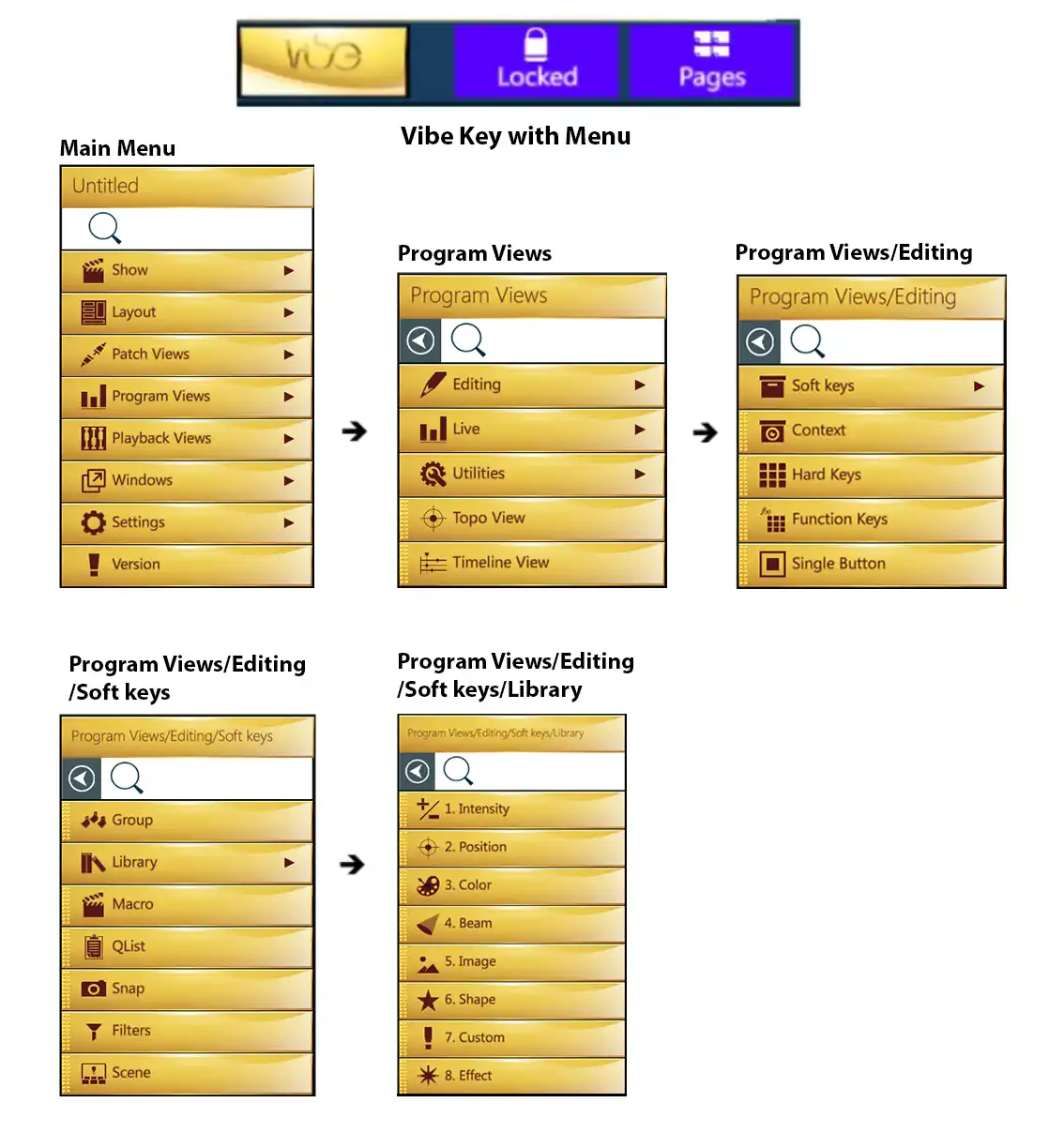
4.2.1 Show Menu
Open the Show Menu to access the following options.
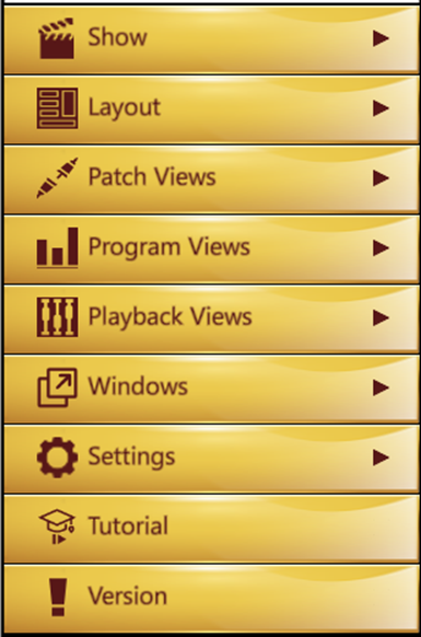
{New Show} - Starts a new show.
{Save Show} - Saves the current show.
{Save Show As…} - Opens a popup to name and save the current show, on Vibe or on an external device.
{Load Show} - Opens a popup to load a saved show file.
{Load Vector Show} - Opens a popup to load and convert a show from Compulite Vector.
After selecting the Vector show file, the popup will guide you through the process of device-matching and show conversion options.
Vector Shows may be loaded with the following limitations:
Devices:
If a matching device exists in Vibe that device will be used. Modes will be matched.
If a similar device exists, it will be used. Modes will try to be matched.
If no match or close match is found, a generic device will be created.
Patch:
- Vector device parameter DMX will be mapped to Vibe parameter DMX.
Qlists:
- Qlists will be matched.
Cues and Cue Values:
- Matching Cues will be created with Vector cue parameter values matched to Vibe cue parameter values.
Temp Cues:
- Temp Cues are converted to Vibe Scenes.
Vector Submasters:
- Submasters are converted to Vibe Scene Submasters.
Groups:
- Groups will be matched.
Snaps:
- Snaps will be mapped with Vector physical playbacks being mapped to Vibe virtual controllers when the number of Vector Playbacks exceeds the amount of Vibe Controllers.
Macros:
- Currently not supported.
Effects:
- Currently not supported but under development.
Vector Playbacks ⟶ Vibe Controllers:
- Paging is matched and all button functions common to Vector and Vibe are matched.
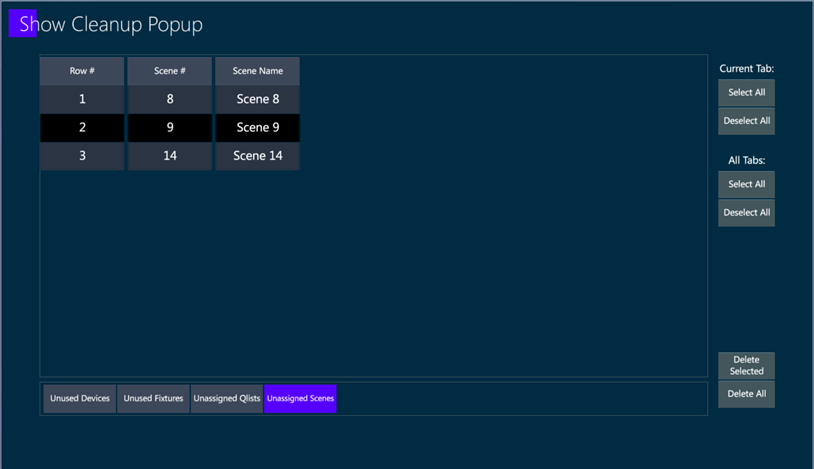
{Clean Up Show} - Opens a popup where it is possible to check and delete the data that are not being used in the show.
{Report} - Opens a popup where it is possible to create excel files with the data of the show, such as Groups, Libraries, Qlists and Scenes content.
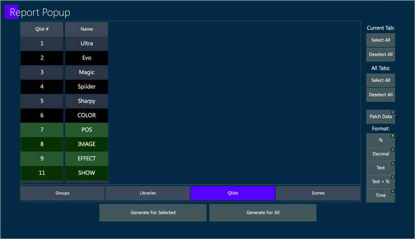
The Report file can be generated for all the data or just for the selected objects.
The Reports are saved in the Reports Folder inside WorkDir.
{Error Report} - Creates an Error Report file that can be shared with Compulite Support in case of software problems.
4.2.2 Layout and Views Menus
Open the Layout menu to access the layout options.
Open the Patch, Program and Playback Views Menus to access all the views to configure Vibe’s workspace.
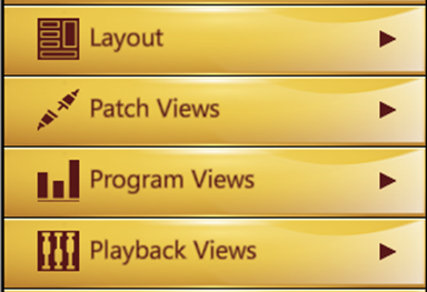
Learn more about configuring the workspace and layouts in the dedicated chapters.
4.2.3 Windows Menu
Open the Windows menu to access the following options.
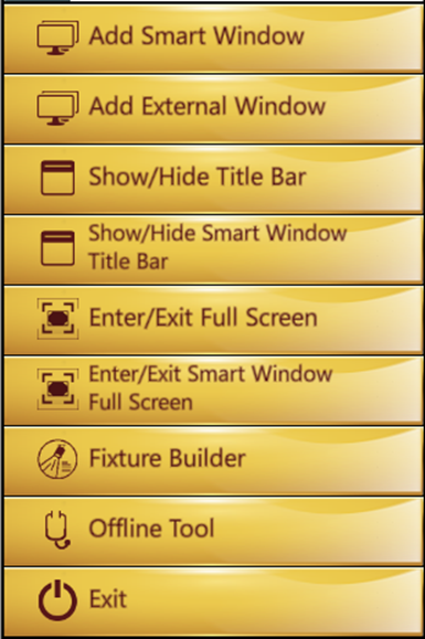
Add a smart window and external windows to be placed on additional screens.
Show / Hide the windows title bar to the window.
Enter / Exit the full screen mode.
Open the Fixture Builder’s- Open the Offline Tool
Exit Vibe (main window) or Close Window (external windows)
Exit Button
The Exit and Close buttons are located in the Windows sub-menu.
To exit Vibe or close a window
Open Vibe menu from the Vibe button
Tap Windows
Tap Exit/Close
A popup will remind to save the show before closing.
4.2.4 Settings Menu
Open the Settings menu to access the following options.
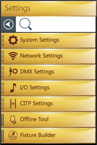
{System Settings} - Opens a popup where it is possible to configure all the general system settings. This window is also directly accessible from the control area in the low right corner of the screen.
{Network Settings} - Opens a popup to configure the Console name and IP Address, find other Vibe systems on the same Network, and create a Client based connection such as the Master / Slave.
{DMX Settings} - Opens a popup to enable, disable and configure the DMX outputs and inputs ports, the network protocols such as VC’s, ArtNet and ACN, and the DMX rate.
{I/O Settings} - Opens a popup to enable, disable and configure the MIDI notes, OSC commands, the Midi Show Control, and the timecode protocols such as MTC and SMPTE.
{CITP Settings} - Opens a popup to enable, disable and configure the CITP settings. Learn more about configuring CITP in the dedicated chapters.
4.3 Pages
Vibe has 3 types of workspace templates, organized in the Page screen.
The Patch Template
The Program Template
The Playback Template
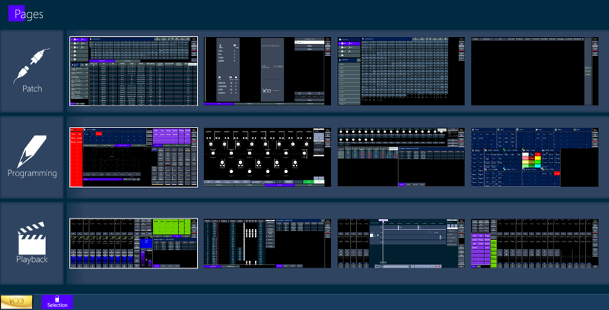
The Page screen can be accesses by tapping Vibe Menu and then Pages on the toolbar, or by pressing the VIEW button.
All the Page types can be composed with any view, independently from where the view is located in the Vibe Menu. The pages can also be switched from one type to another, as soon as one of the 4 spaces per type is available.
On the Console it is recommended to set views such as the System Status and the Playback Status on the bottom of the Program and Playback pages, to have them in correspondence to the physical controllers.
Home Pages
Layout home page buttons are a fast recall for up to three main pages.
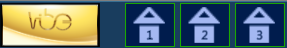
Any page can be stored as a Home Page on the Editor Toolbar, near the VIBE menu button.
To set up home pages
Open the Vibe menu and press Pages button on the editor toolbar
Enable Selection in the Pages view
Select a Page and assign it as a Home Page on the Toolbar
F1 keyboard button also switches between the three Home Pages.
Clone Pages
Clone layout pages for a faster building of a similar layout page.

To clone a page
Open the Vibe menu and press Pages button on the editor toolbar
Enable Selection in the Pages view
Select a Page and clone it with the button on the Toolbar
4.4 WorkSpaces
4.4.1 Basics
When configuring workspaces, any object at the end of the hierarchical sub-menu can be tapped to open its object on a blank portion of the current workspace or dragged and dropped to the workspace surface. Once on the surface it may be moved or sized freely, space permitting.
If an object is dragged on top of another both will turn green and become one tabbed object.
To edit the placement of objects, the {Lock} icon beside the {VIBE} menu key must be toggled to unlock the workspace display. After changes are made, it must be toggled again to lock the display and allow normal usage.
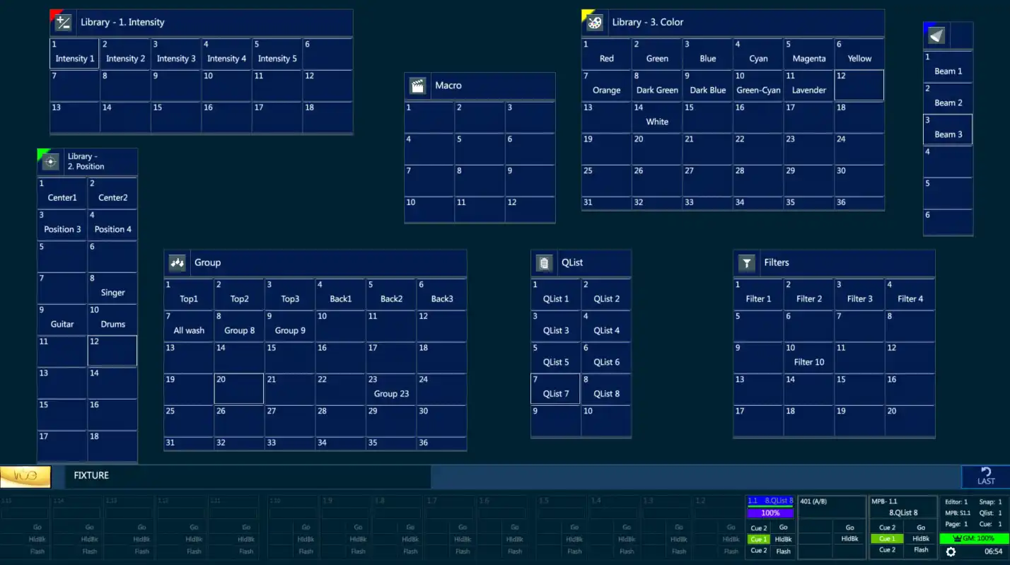
Some of the views have their own settings that can be accessed when layout is in edit mode, the view is selected and tapping the {Settings} button on the toolbar.
4.4.2 View Settings
The views have their own settings that can be accessed when the layout is in edit mode and the view is selected, by tapping the buttons on the toolbar.

4.4.3 Toggle Scrollbar
The Toggle Scrollbar button, in the scrollable views’ settings, adds or removes a scrollbar to/from the view.
4.4.5 Frame Color
Frames colors can be customized for a better graphical separation between the views.
4.4.6 Softkey Settings
Any softkey view can be graphically customized by selecting it in layout edit mode and opening the settings popup with the {Settings} button on the toolbar.
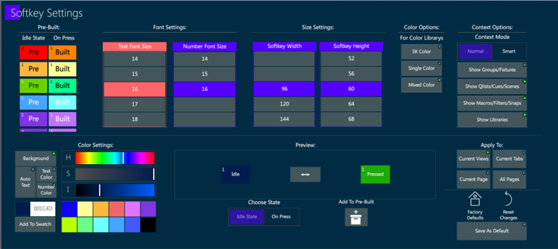
Softkey settings are used to change the size, font and color of the softkeys’ text and background.
The settings can be saved as Pre-Built and applied to the other views of the same tab, page, or to the softkey views in all the pages.
The settings can also be saved as default, and it’s always possible to come back to the default or to reset the changes.
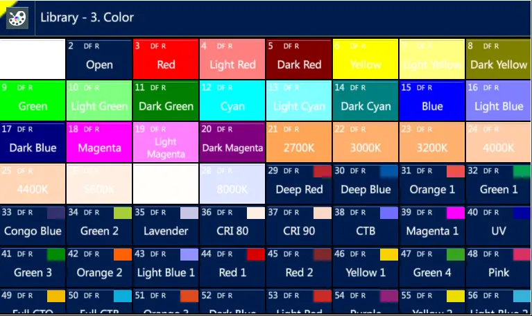
Some special color options are available to show color library softkeys with the softkey color either with the color or the colors that are stored in the library.
The icon in the view’s header can be clicked to quickly jump to the top of the scrollable softkey views.
Softkeys Auto Text Color Setting
The auto text color option in Softkey Settings popup automatically sets the softkey’s text color in black or white in contrast with the softkey’s background color, to make it always visible.
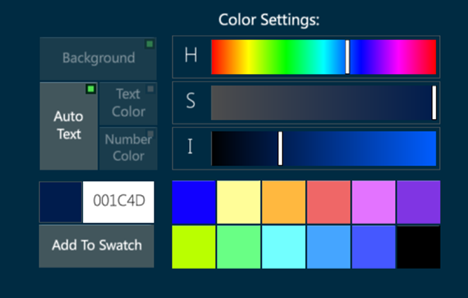
This is useful for the color libraries if combined with the Mixed Color option.
Context Options
Context view can show or hide the visualized objects depending on the user’s settings or on the smart option.
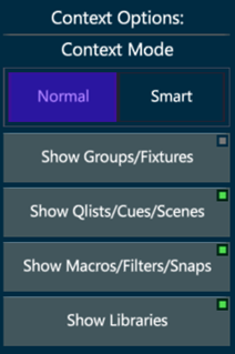
The Context Normal Mode filters the visualized objects according to the enabled buttons.
The Context Smart Mode filters the visualized objects automatically avoiding the softkeys that are already visible in the page.
4.4.7 Single Button Settings
Any softkey view can be graphically customized by selecting it in layout edit mode and opening the settings popup with the {Settings} button on the toolbar.
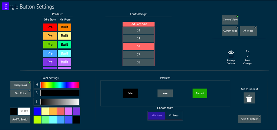
Specific settings, such as color and text size, can be assigned to each single button.
The settings can be saved as Pre-Built and applied to the other single buttons of the same tab, page, or to the buttons in all the pages.
The settings can also be saved as default, and it’s always possible to come back to the default or to reset the changes.
4.5 Layouts
Layouts:
- After all workspaces and associated pages are configured, the display configurations of the workspaces can be saved to a Layout by tapping the {VIBE} Menu and then the {LAYOUT} key.
A Sub-menu will open with options to {SAVE LAYOUT}, {LOAD LAYOUT}.
After configuring external monitors, a layout should be saved to preserve the external monitor layout on reboot.
Layouts remember the configuration of external monitors and a warning message will appear if the system is booted without the expected external monitor.
Layout Settings
Open the Vibe Menu and tap Settings to access the Layout Settings popup. From here it is possible to change the Vibe Theme, move the Taskbar to top or bottom position on all the pages, and set Default View Settings such as the Headers, the Frames and the Scrollbars.
4.6 Smart Screen
The 11.6” multi-touch monitor embedded in the upper section of the Vibe console is referred to as the Smart Screen. The Smart Screen is dedicated to displaying context sensitive interactive bank, wheel, and parameter information.
For more detail see:
4.7 Toolbars
The Editor Toolbar contains is a set of interactive Softkeys that are used to access less common commands:

The Patch Toolbar contains two pages of options:
- Idle state toolbar

- Fixture selection state toolbar

4.8 Live Display
Vibe has two ways to display parameter data:
- Live Display - Displays cue and editor data as a spreadsheet.
- Live Parameter Display - shows values in a table format instead of spreadsheet format.
Live Display
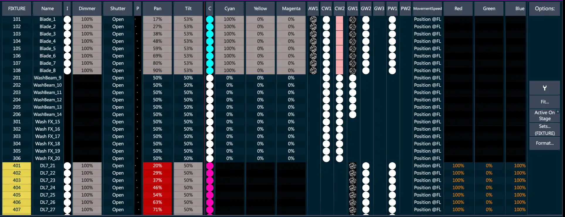
The Live Display has a number of options that may be set under the Options field:
 - Opens Live View Settings. (See 4.8.1.Live View Settings.)
Fit - Opens column width options.
Fit to Window
Fit to Value
Fix by Text
Default
Active on Stage - Only parameter columns that are selected in the editor or have values derived from the active stage look are shown. All others are hidden.
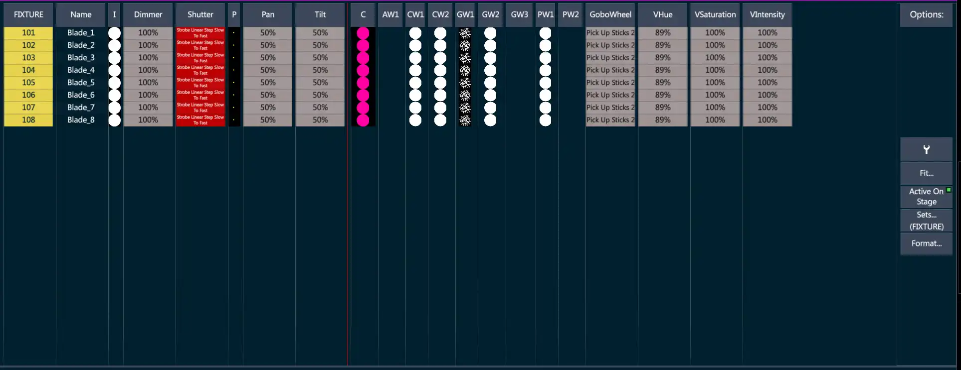
Sets - Select which of the fixture sets to display.
Fixture s Channel
Spot s Matrix
Media Server
Other custom Sets if created
Format - Controls what format the data is displayed in.
% - Values in percentage
Decimal - DMX values 0 ⟶ 255
Text - Parameter step text
Text + Percentage
4.8.1 Live View Settings
Live View Settings pop-up - Display Tab.
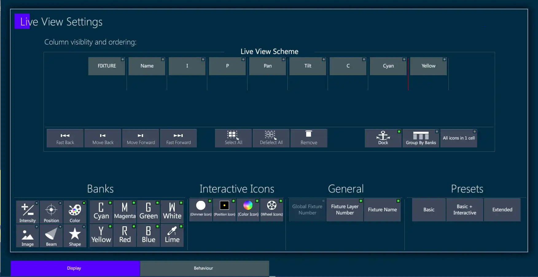
Live View Scheme - Parameter columns may be freely added, removed, moved in using the Live View Scheme.
Move columns:
Tap a parameter column heading or multiple parameter column headings - the green indicator light will turn on.
Use the {|<} or {>|} keys to move the parameter column forward or backwards.
Move columns to the first or last column position:
Tap a parameter column heading or multiple parameter column headings - the green indicator light will turn on.
Use the {|<<} or {>>|} keys to move the parameter column first position or last position.
Remove columns:
Tap a parameter column heading or multiple parameter column headings - the green indicator light will turn on.
Tap the {Remove} key.
Dock - Locks the column scroll at the end of the parameter column that is docked. A red line will show on the live display to show the dock position. (Group By Banks and All icons in 1 cell are not implemented yet)
Add Columns - Columns are added using the Banks section of the pop-up.
Select a bank - All parameters for the bank will appear in the box adjacent to the banks.
Select the parameter or parameters to add to the live display. 👉 Swipe in the the parameter box to browse hidden parameters.
Tap a parameter that is not already selected in green and it will be added to the end of the column list.
👉 Parameter keys are toggles so if the indicator light is on, touching the parameter will remove it. Tapping again will put it back at the end of the columns. .
- Use the {|<} or {>|} {|<<} or {>>|} to position the column.
Interactive Icons:
- Adds or removes the icon columns.
👉 Interactive Icon keys are toggles so if the indicator light is on, touching an icon key will remove it. Tapping again will put it back at the end of the columns..
General:
- Global Fixture Number - Fixture’s hidden unique system number.
- Fixture Layer Number - Adds or removes Fixture Number column.
- Fixture Name - Adds or removes Fixture Name column.
👉 Fixture # and Fixture Name are toggles so if the indicator light is on, touching an icon key will remove it. Tapping again will put it back at the end of the columns.
Live View Settings pop-up - Behavior Tab
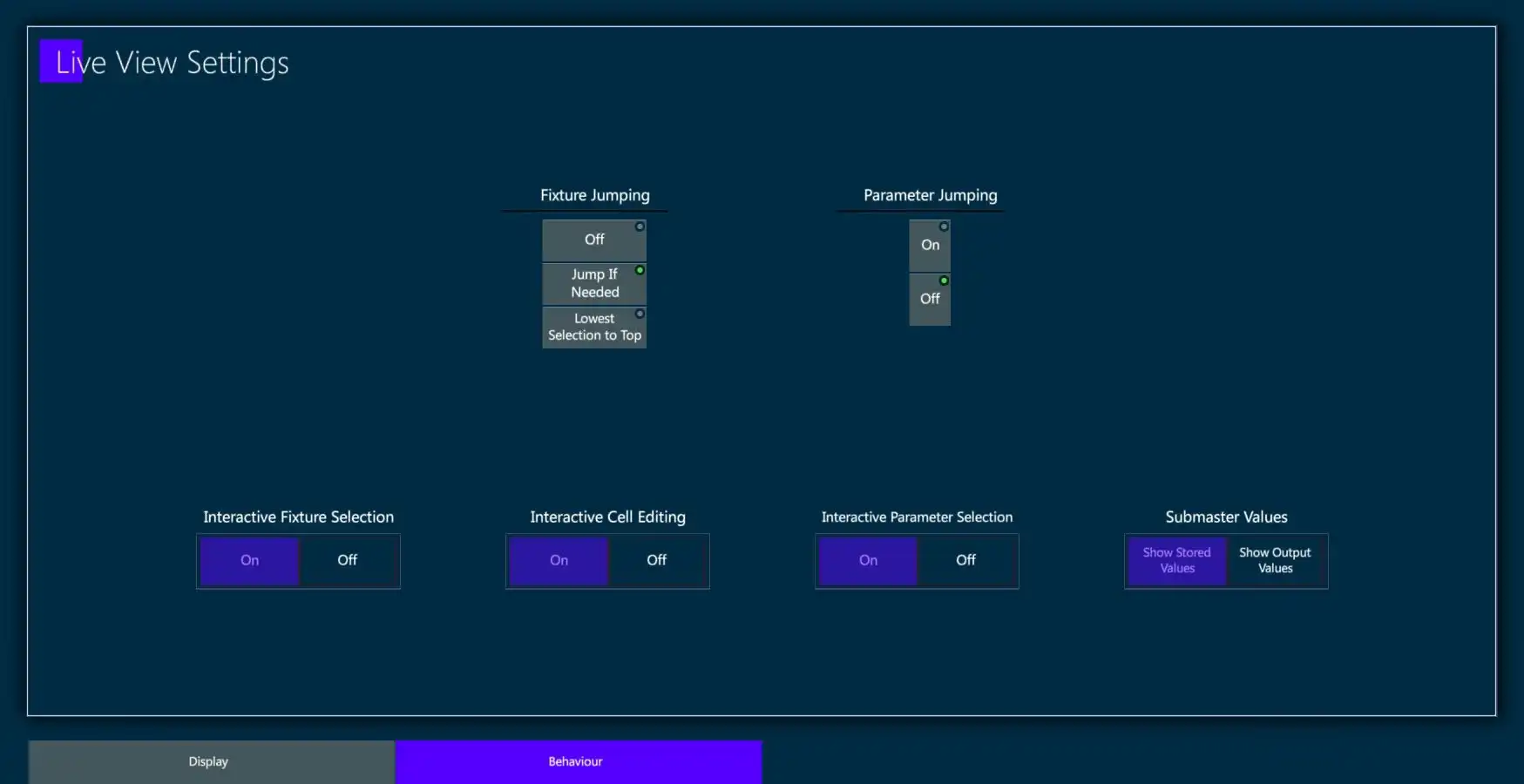
Fixture Jumping:
- Off
- Jump if needed - live display pages the display to show the selected fixtures if they are not shown on the current live page.
- Lowest Selection to Top - Jumps the lowest fixture number of the selection to the top of the live display.
Parameter Jumping:
- Jumps the parameter’s column and related bank parameters to the end of the dock position. (First scrollable column).
Interactive Fixture Selection:
- Turns on the ability to make fixture selections from the live display grids.
Interactive Cell Editing:
- Turns on the ability to directly edit cells in the live display grid.
Interactive Header selection - Currently implemented but may not be turned off.
- Enables parameters to be directly selected from the live display headers.
Submaster Values:
- Show Stored Values - Dimmer parameters under the control of Group Submasters will continue to show their stored values and the
 icon will also be shown to indicate when the parameter is inhibited.
Show Output Values - When the Submaster is pulled down, the actual dimmer output values will be shown in the live display dimmer column.
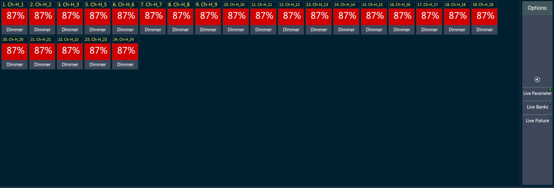
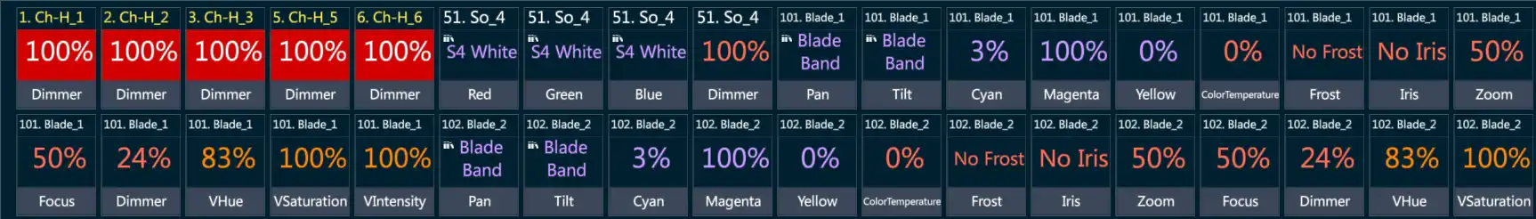
4.9 Live Parameter Display
The Live Parameter Display shows values in a table format instead of spreadsheet format.
There are three Live Parameter Modes:
Live Parameters
Live Banks
Live Fixtures
Live Parameter Mode is mainly used to display single parameter fixtures similar to theatrical consoles but is far more versatile.
4.9.1 Parameter Mode
Unlike most theatrical consoles, parameters other than dimmer may be shown in Live Parameter Mode.
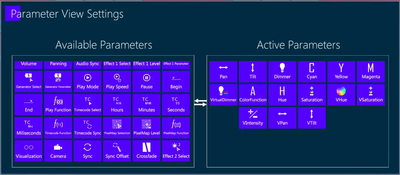
Parameters visible in Live Parameter Mode are filtered using the Parameter View Settings Pop-up.
Filter Parameters:
Tap the
icon - The Parameter View Settings pop-up will open.Tap parameters on either side to move them from one box to the other.
Close the pop-up using [ENTER] or

4.9.2 Bank Mode
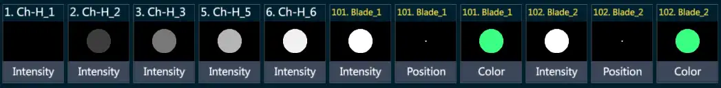
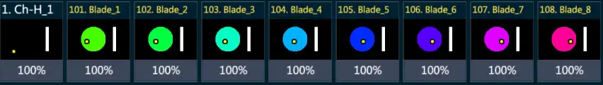
Fixtures may also be graphically displayed by banks.
Currently, three banks can be graphically viewed: Image will be implemented soon.
Intensity - In the form of an illuminated disk.
Position - In the form of a cursor that moves in a black rectangle representing the stage.
Color - In the form of a circular color swatch - Color wheels are not currently supported.